Rebuilding Toddle's mobile app from the ground up — a design system-first revamp bridging 3 years of platform drift
By late 2024, Toddle's web platform had matured to Design System 2.0 — modern, consistent, and scalable. But the mobile app, used daily by parents, students, and teachers, hadn't seen a significant update in nearly three years. The result was a widening platform gap: users moving between web and mobile encountered two entirely different visual languages, navigation patterns, and interaction models.
For families, this showed up as confusion on core flows — navigating announcements, checking attendance, or understanding calendar events. For Toddle, it showed up in rising support tickets, declining app store ratings, and a growing perception that the mobile product was abandoned.
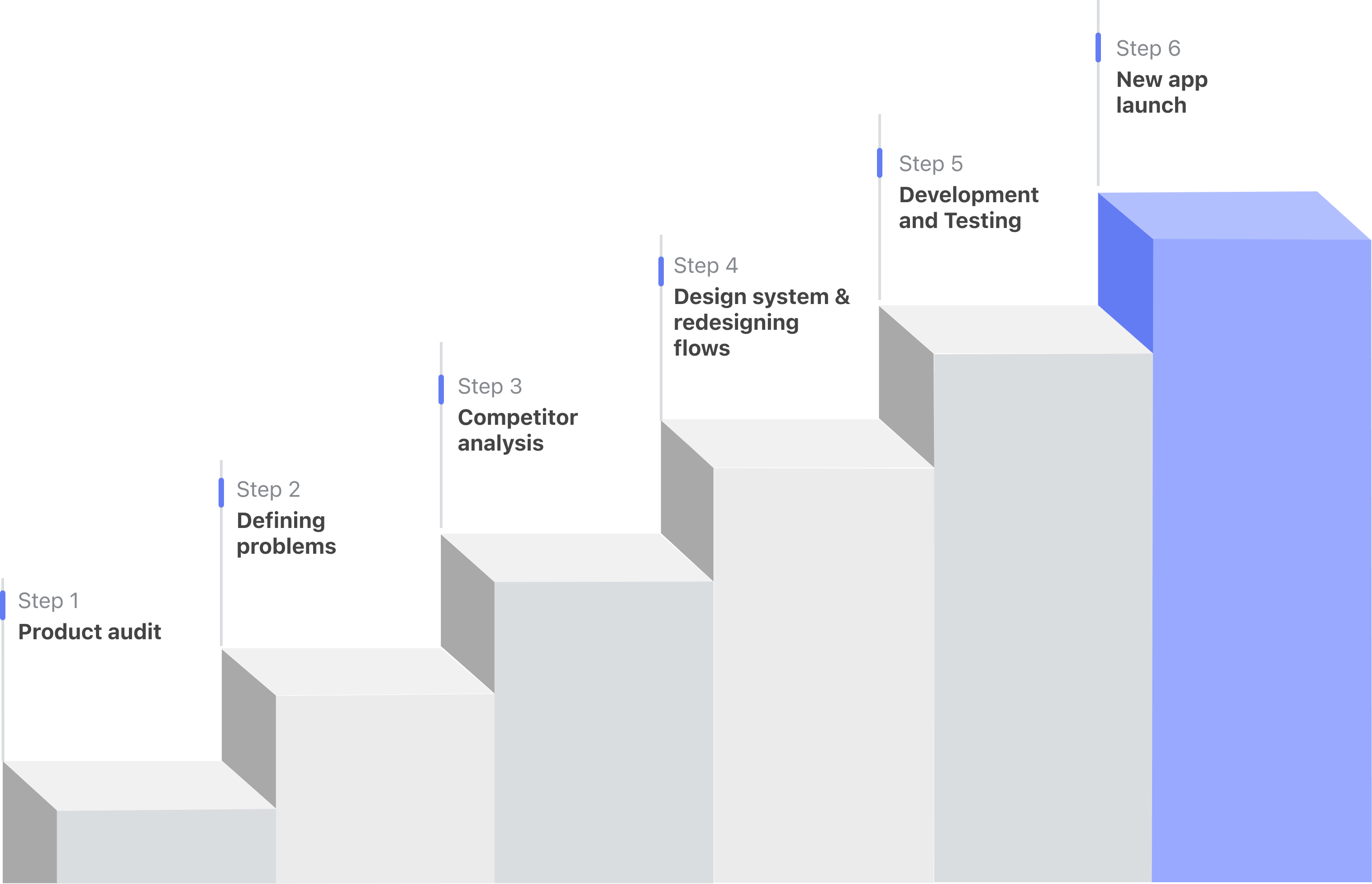
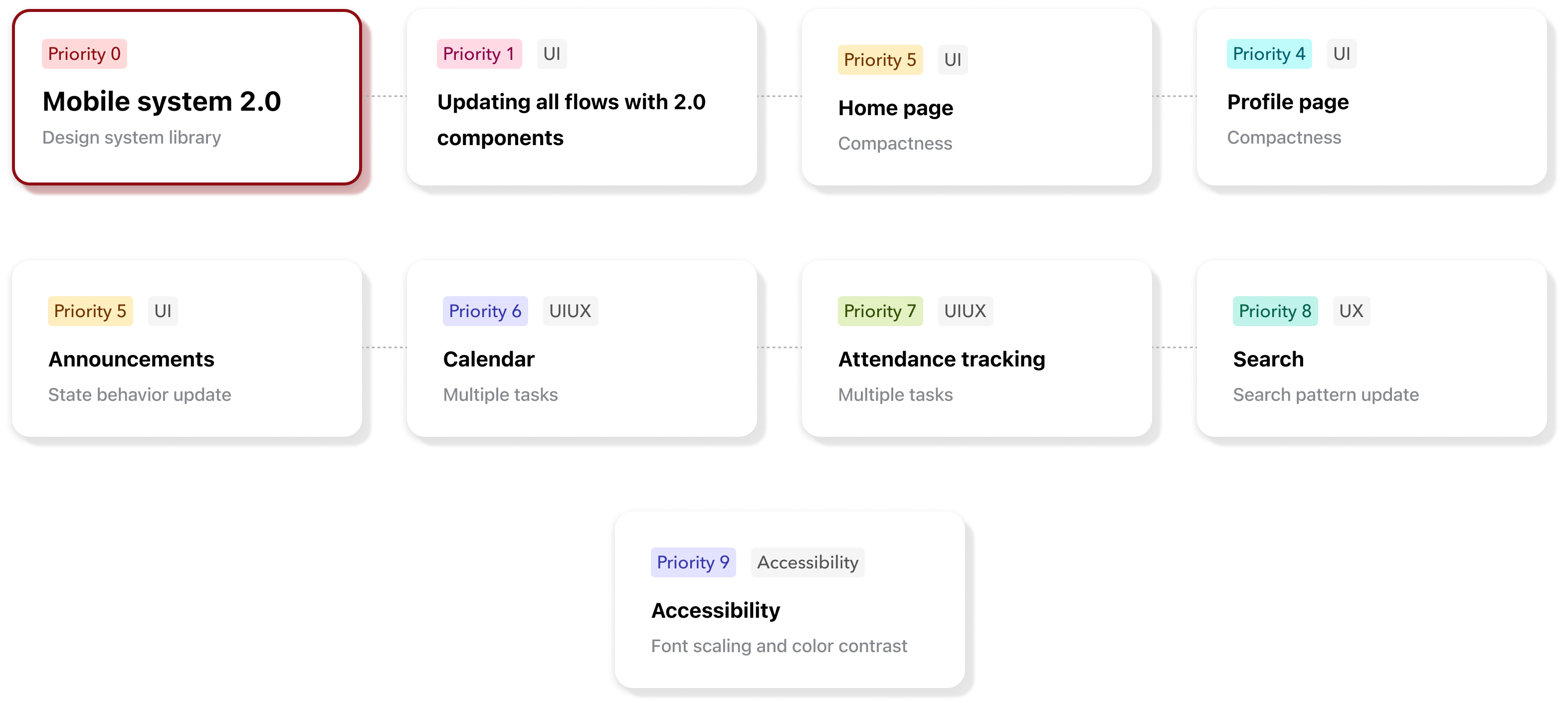
The root cause wasn't neglect — it was prioritization debt. Mobile had been deprioritized while the web platform scaled. By the time we addressed it, the gap was large enough that a component-by-component patch wouldn't work. We needed a ground-up rebuild, anchored in a dedicated mobile design system.
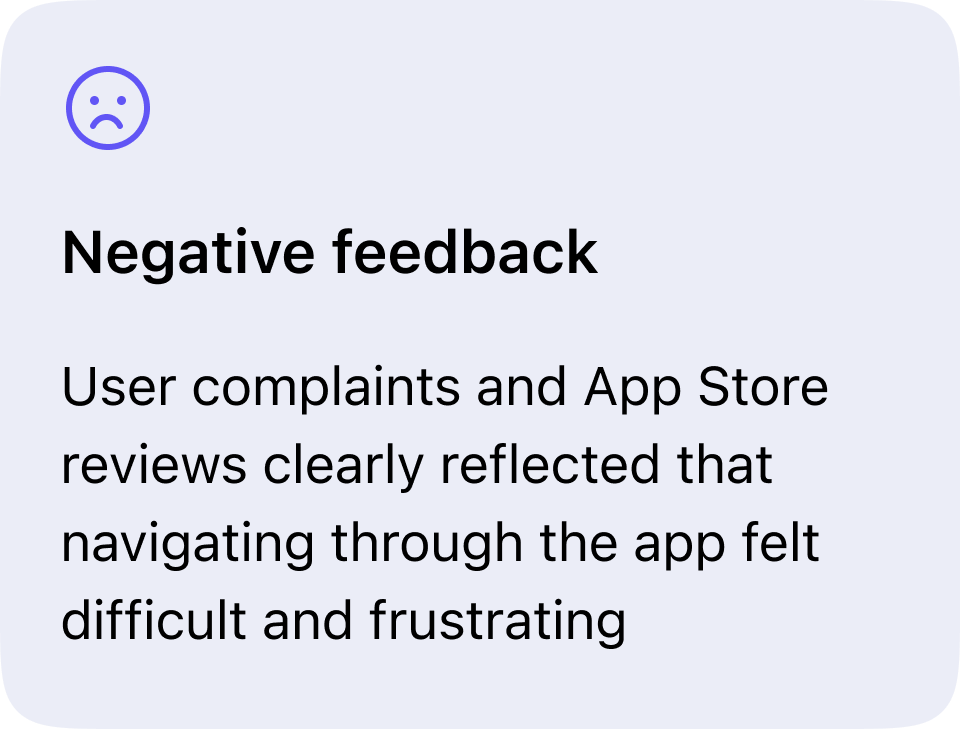
Before redesigning anything, I needed to understand where the mobile experience was actually breaking down — and for whom. Rather than assumption-led design, I grounded the work in two primary signals: an audit of App Store reviews and a review of recurring issues raised by schools and parents through support channels.
"The website looks so much better. The app feels like it hasn't been updated in years."
These signals reframed the work. This wasn't just a visual refresh — it was a trust-restoration exercise. Consistency with the web, predictable navigation, and accessibility support became non-negotiable foundations for the redesign, not nice-to-haves.
For Designers
For Users
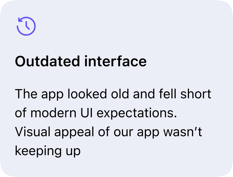
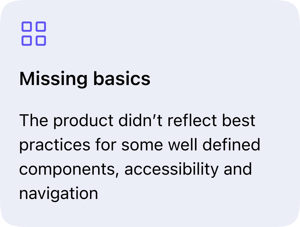
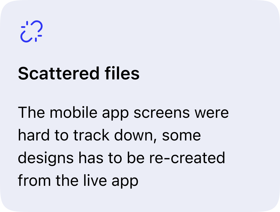
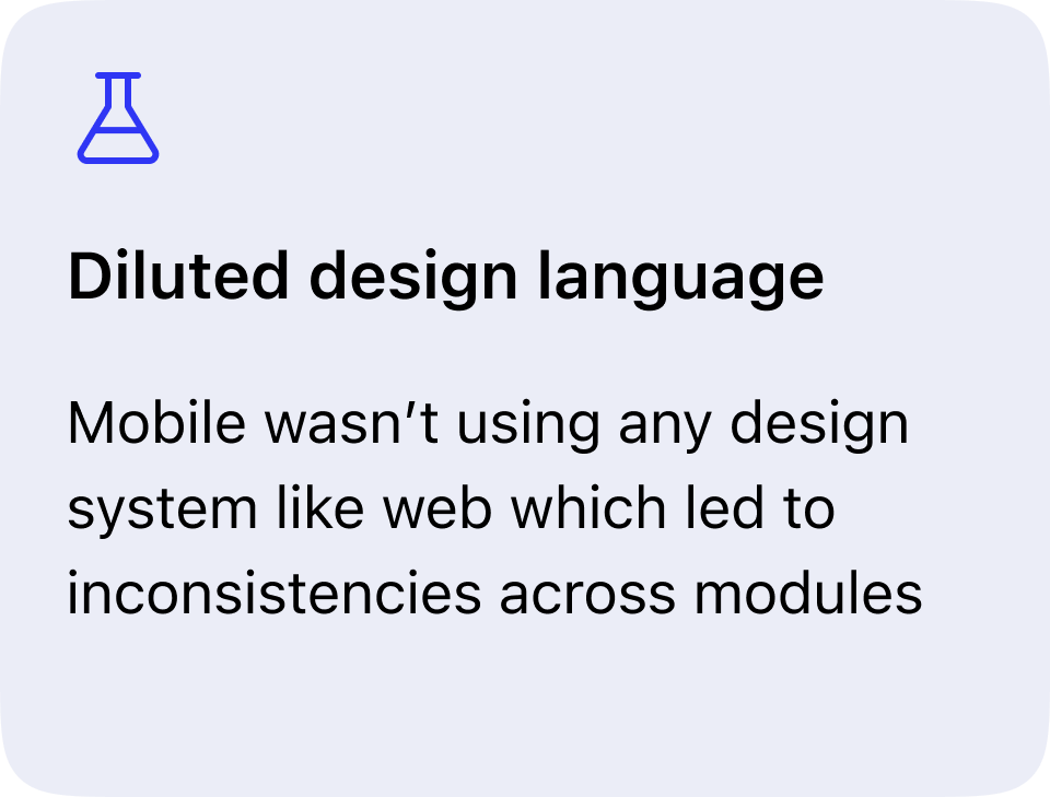
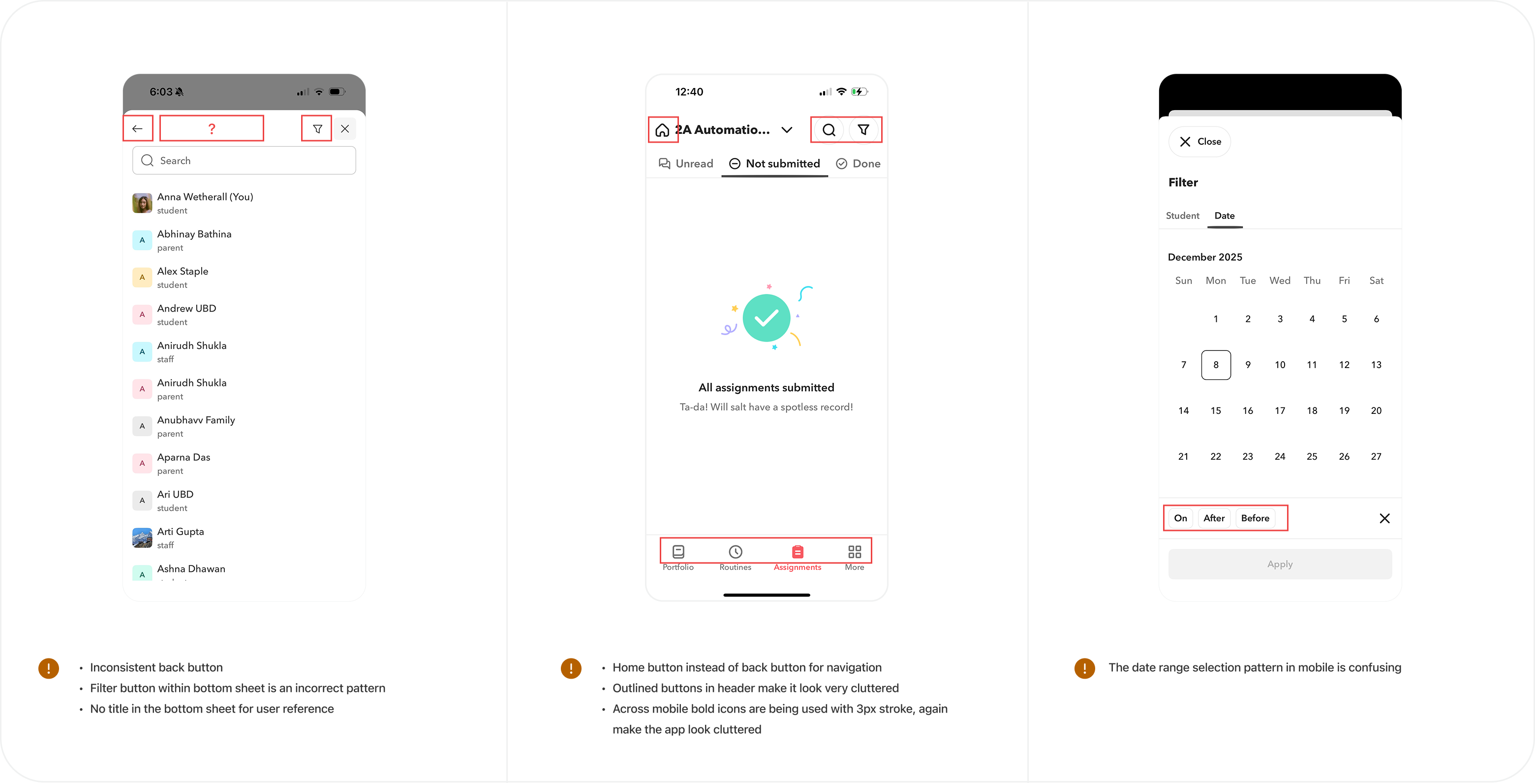
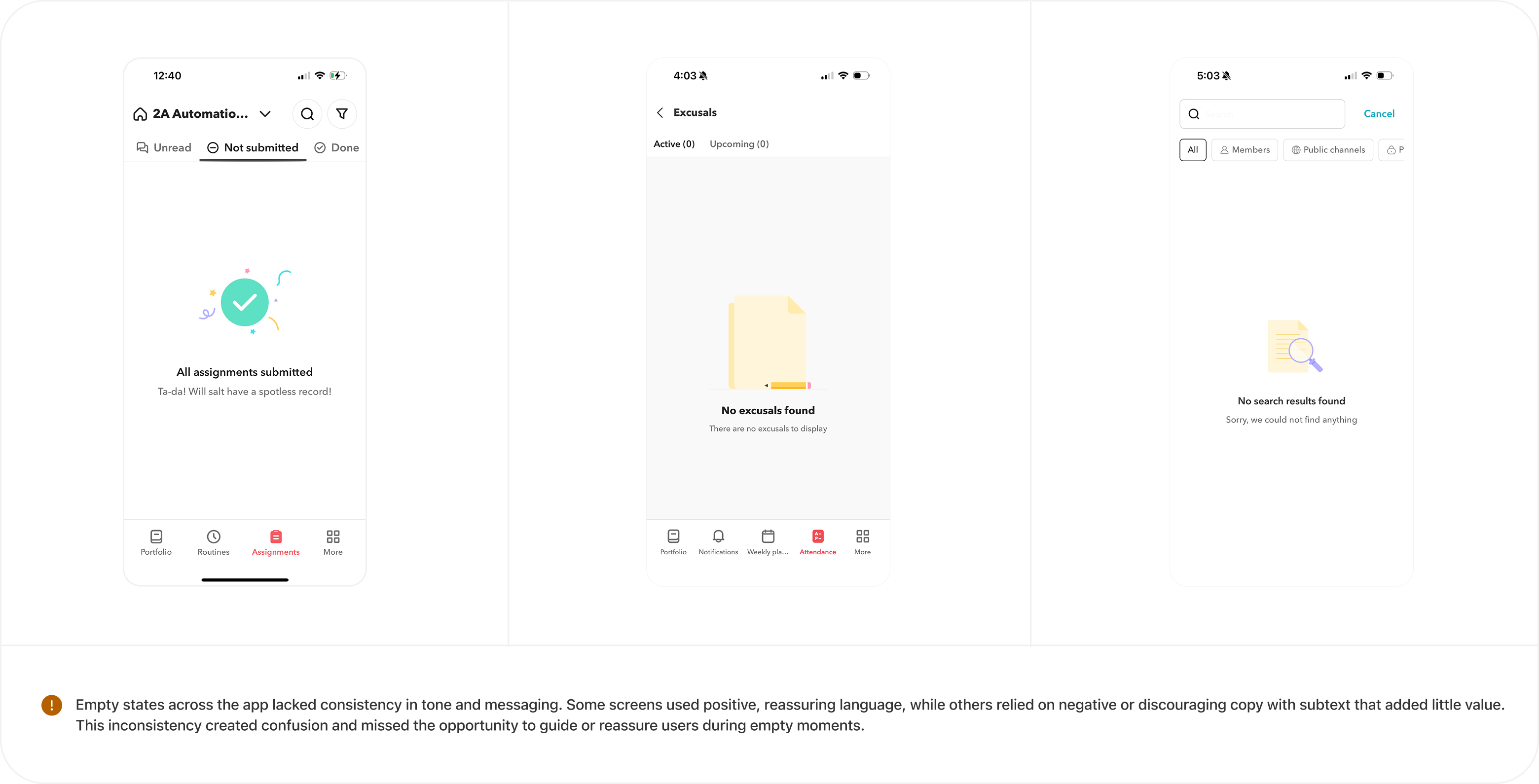
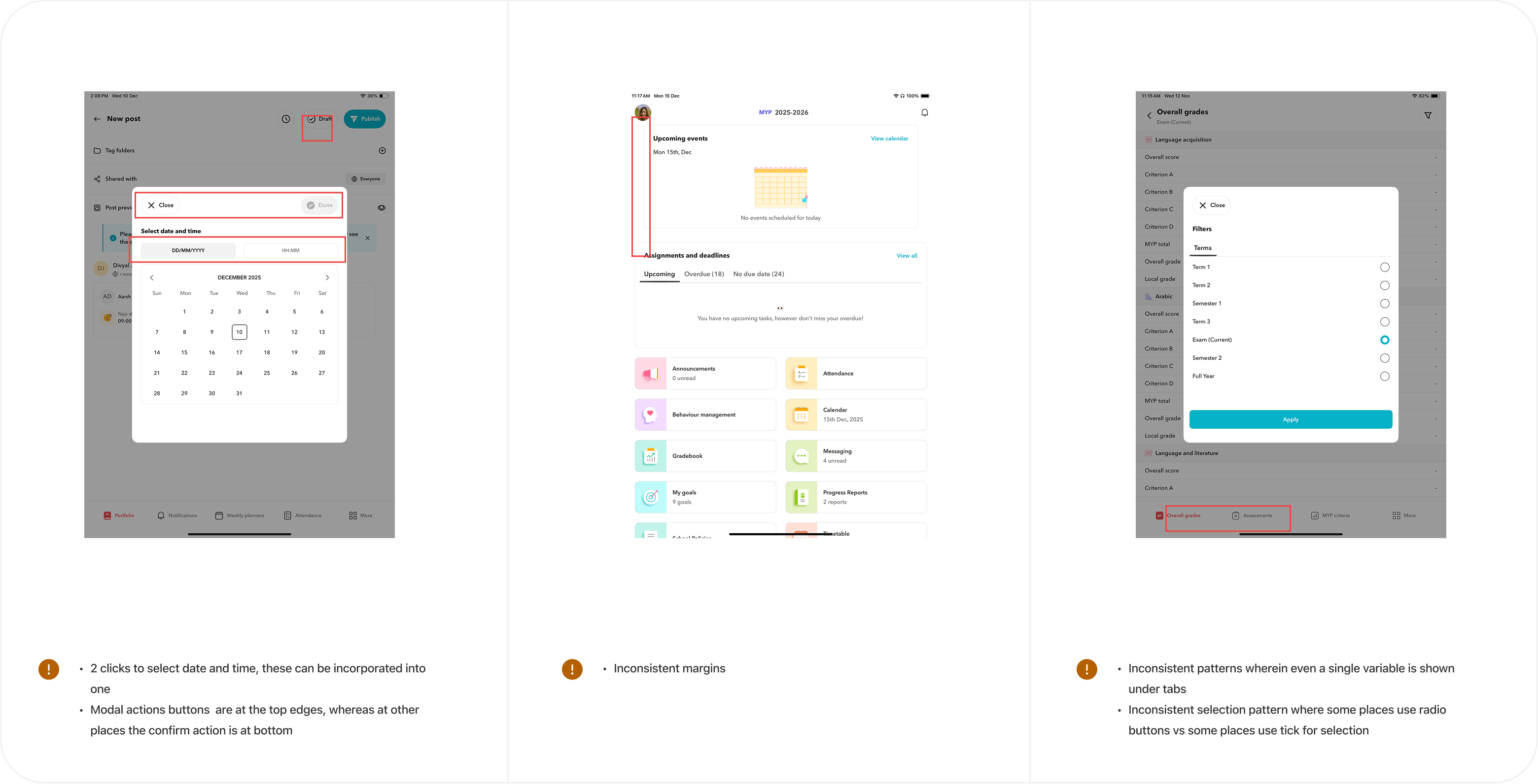
Before diving into redesign, I conducted a thorough audit of the existing mobile app to surface all inconsistencies, broken patterns, and accessibility gaps.
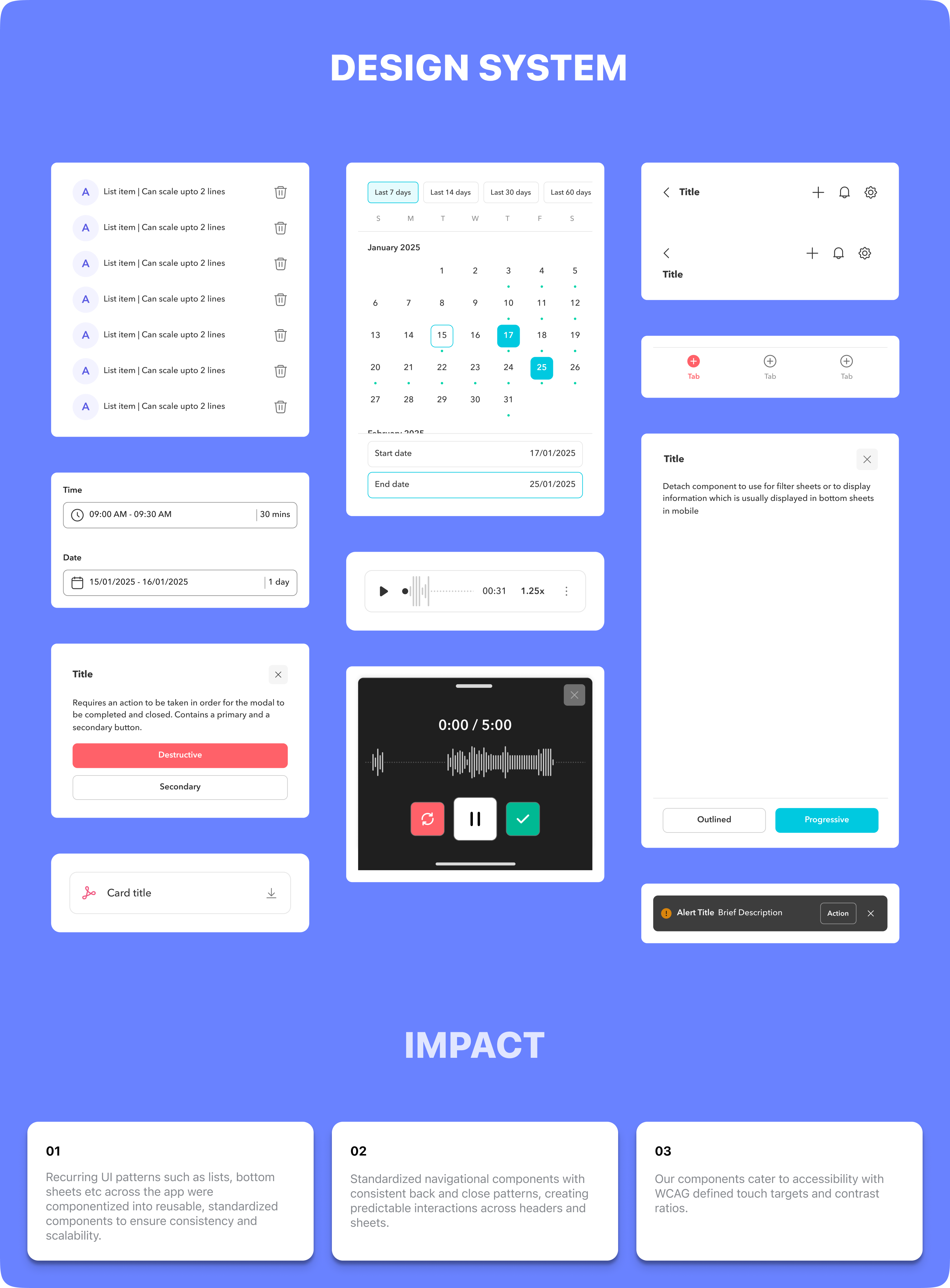
Design System 2.0
The first priority was establishing a dedicated mobile design system to align mobile with Web 2.0 — ensuring every designer could work efficiently using shared patterns and components.
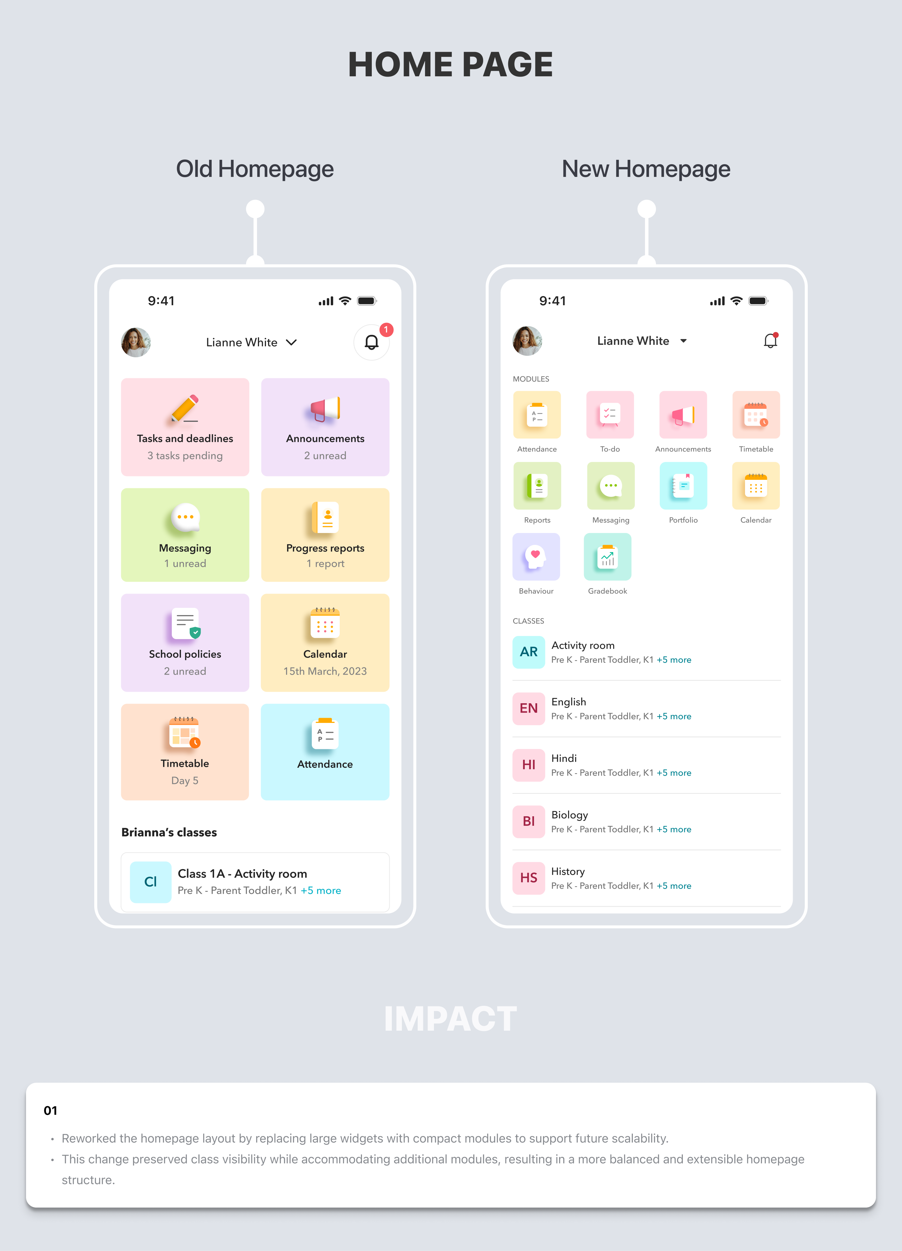
Home Page
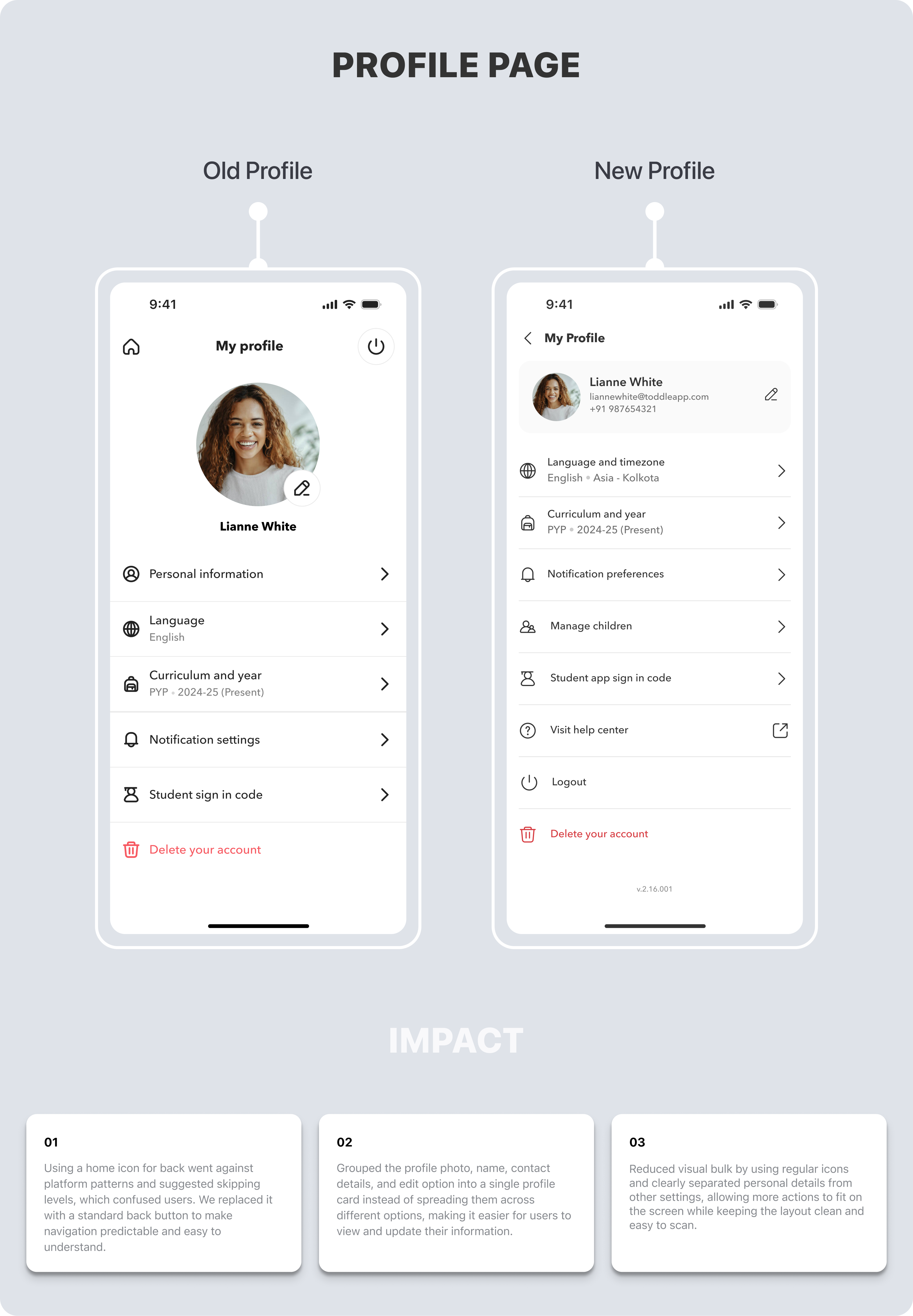
Profile Page
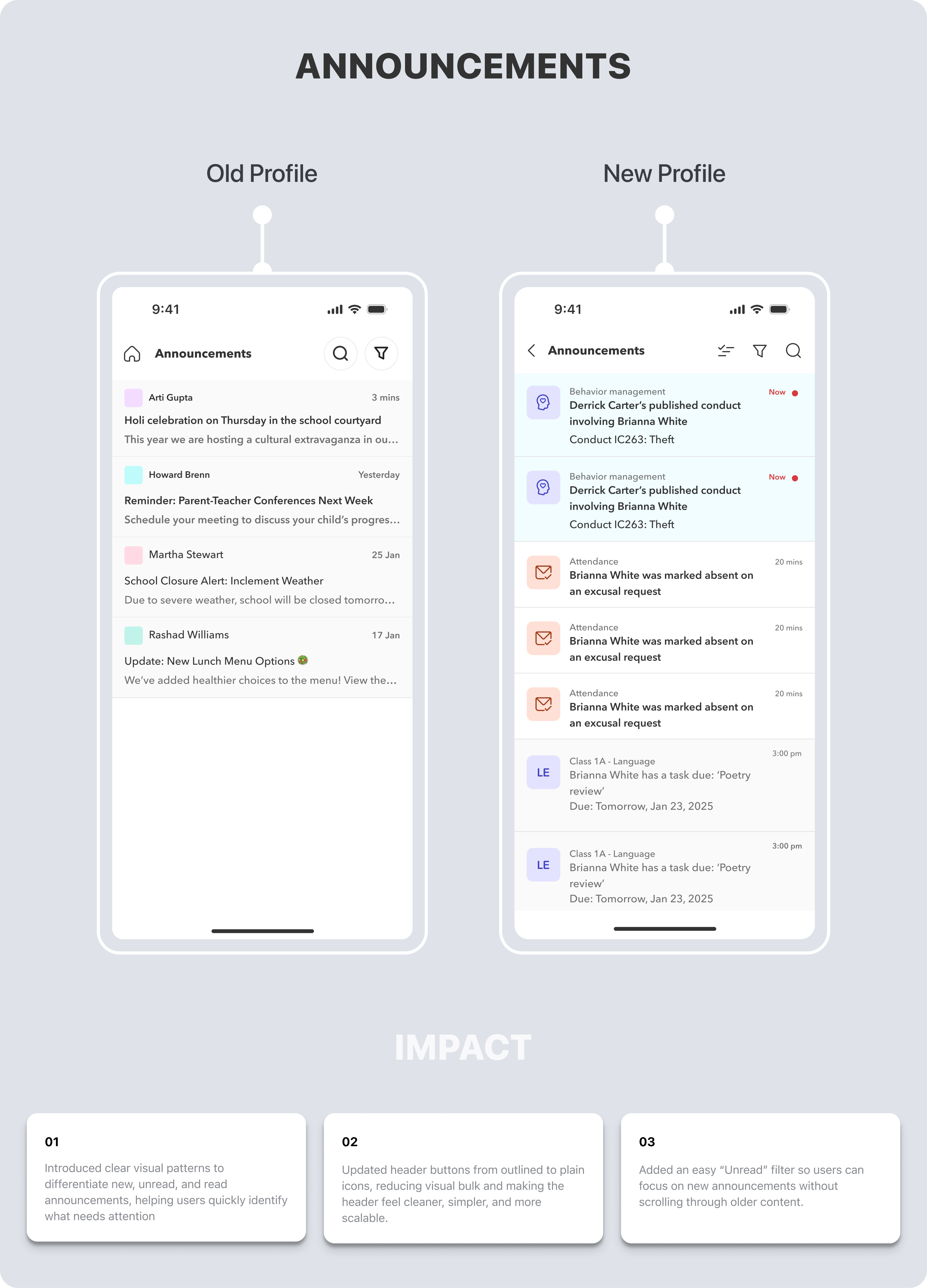
Announcements
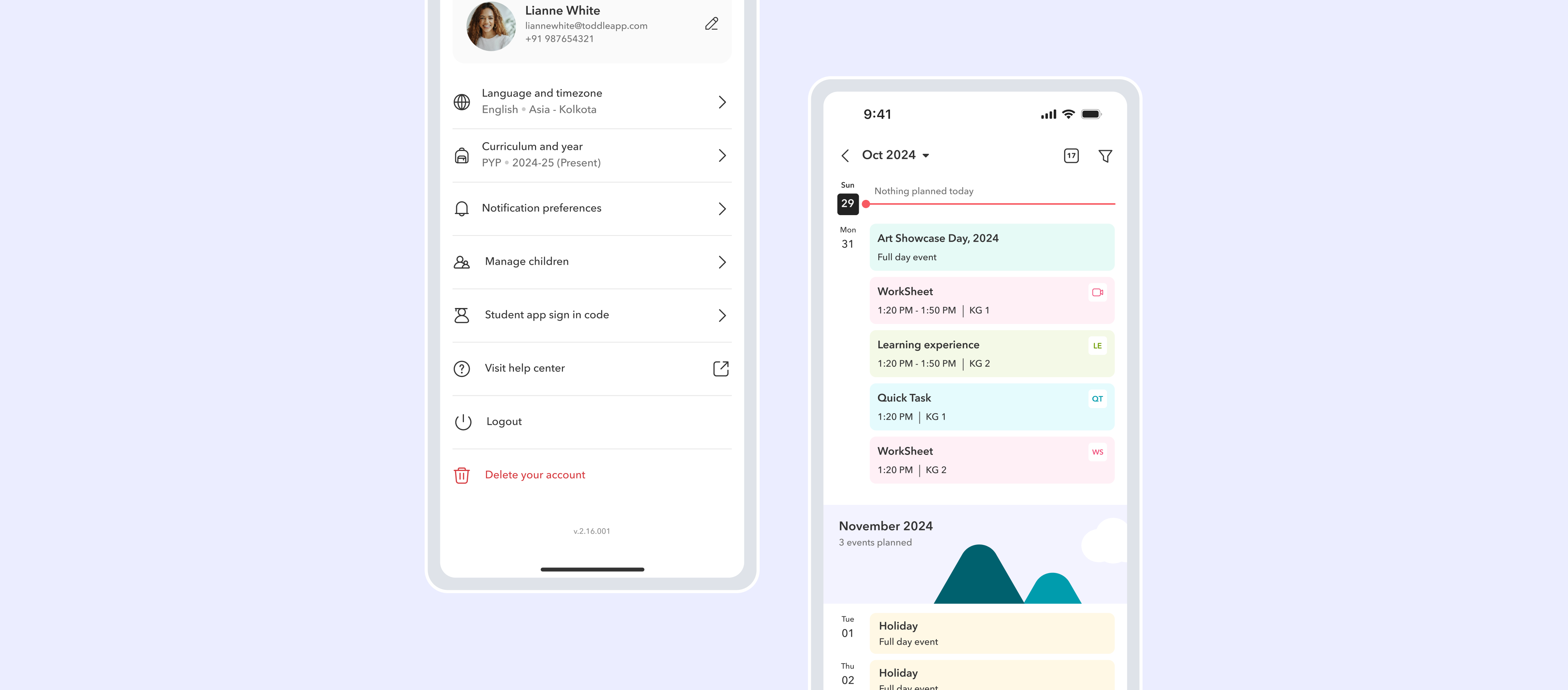
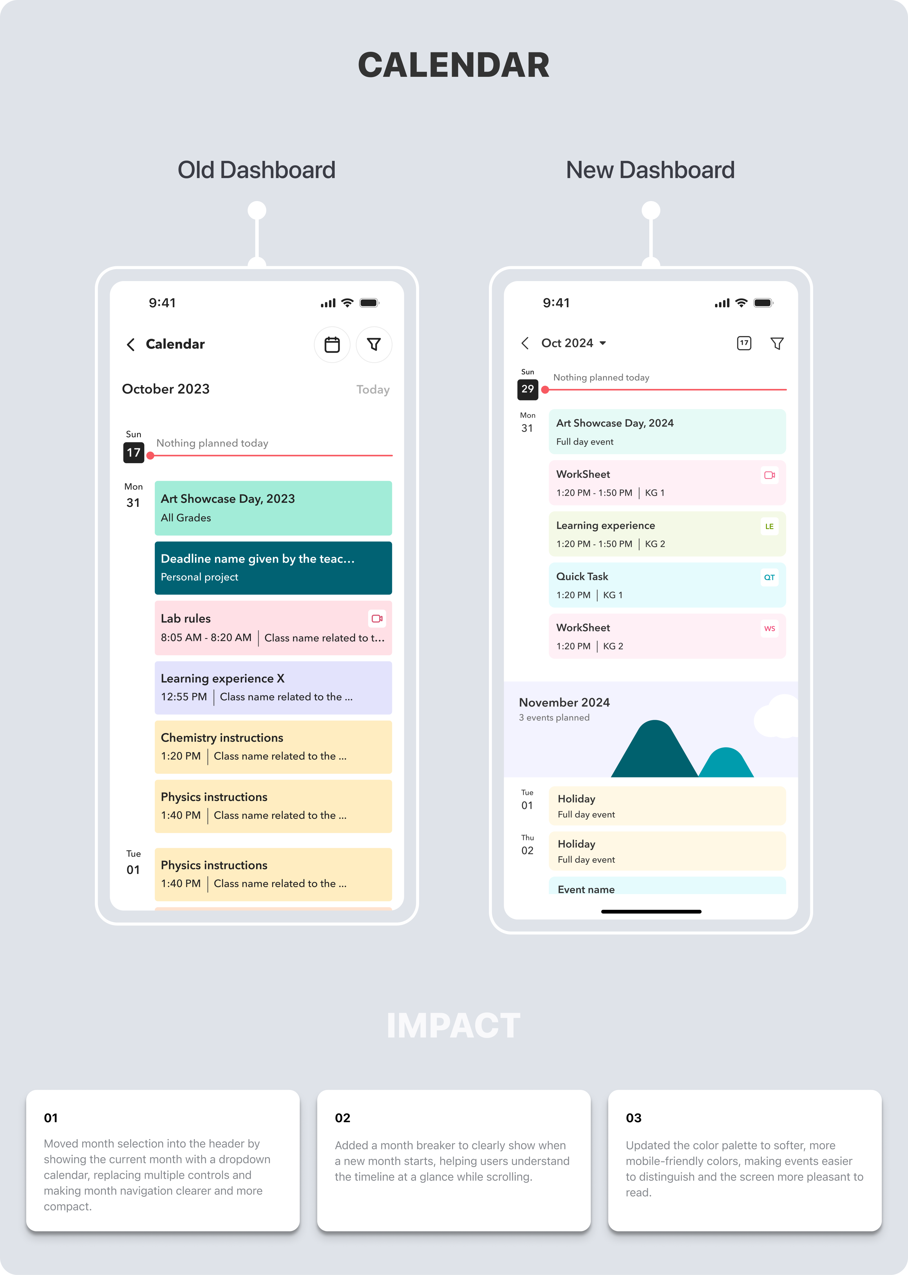
Calendar
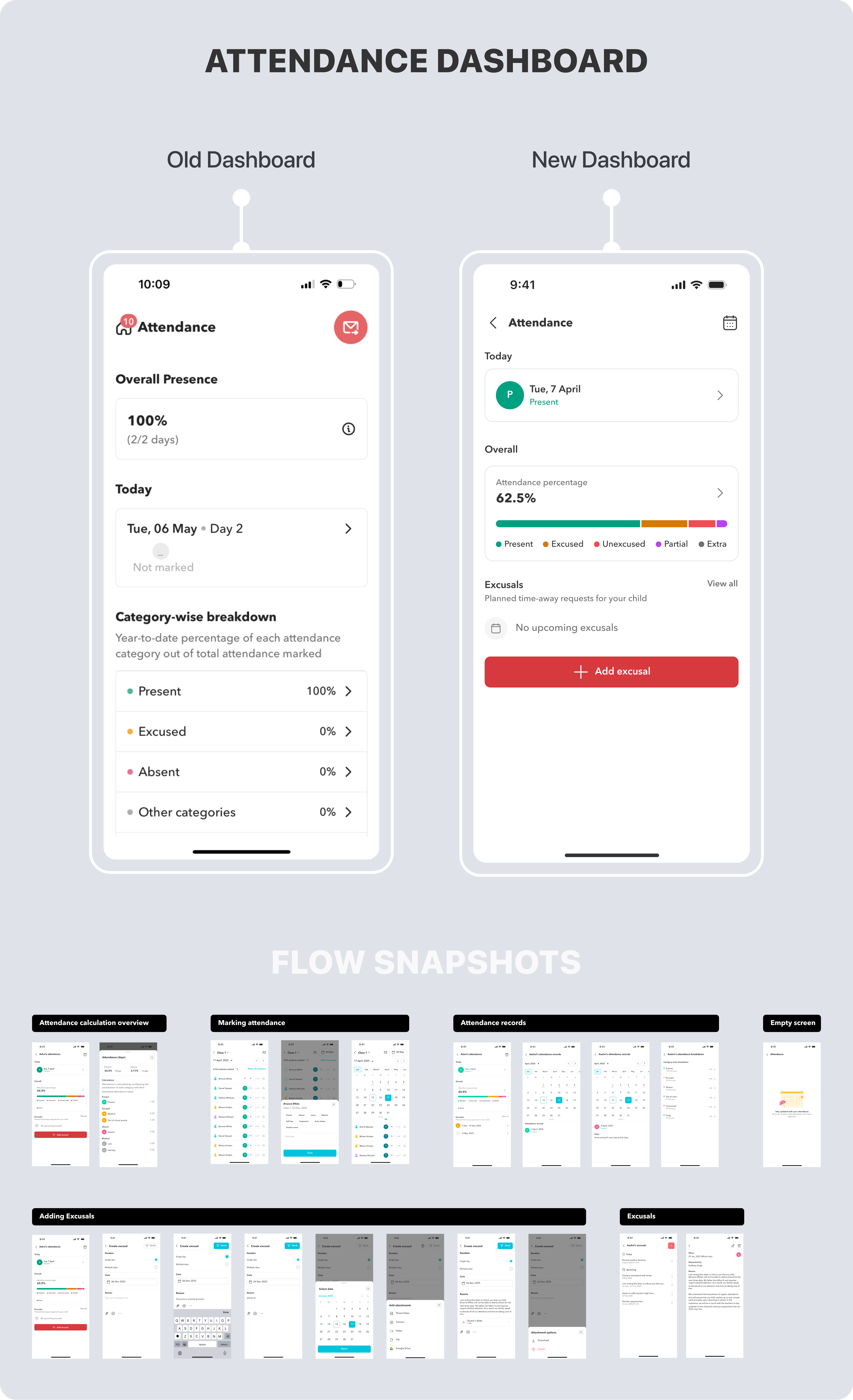
Attendance Dashboard
The attendance flow was one of the most-used and most-complained-about parts of the app. Teachers needed to mark attendance quickly during class; families needed to track and excuse absences; students needed to see their own records. A single fragmented flow was trying to serve all three — poorly. I redesigned the full flow with role-appropriate views for each user type, covering overview, marking, excusals, and category-wise breakdowns.
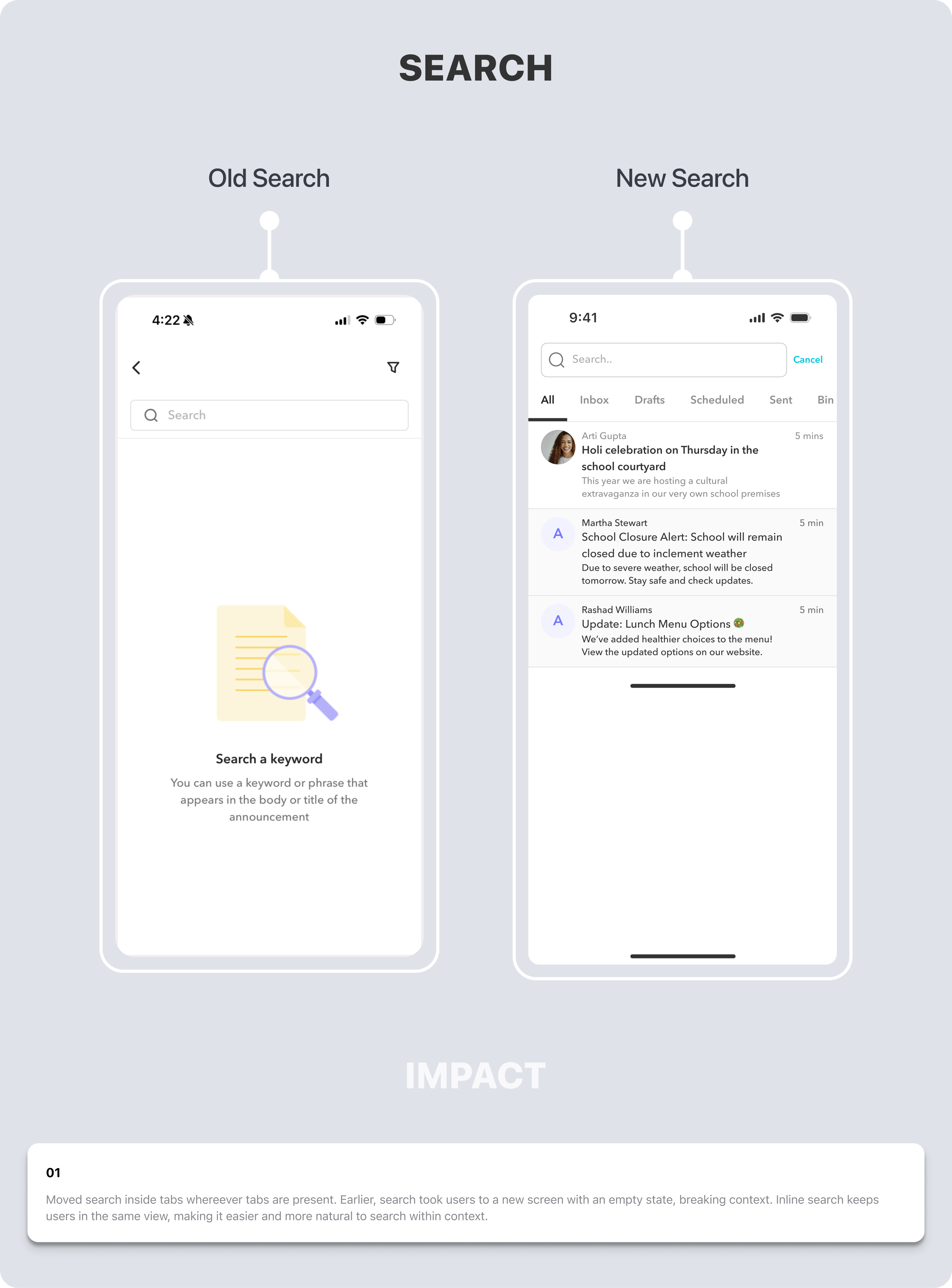
Search
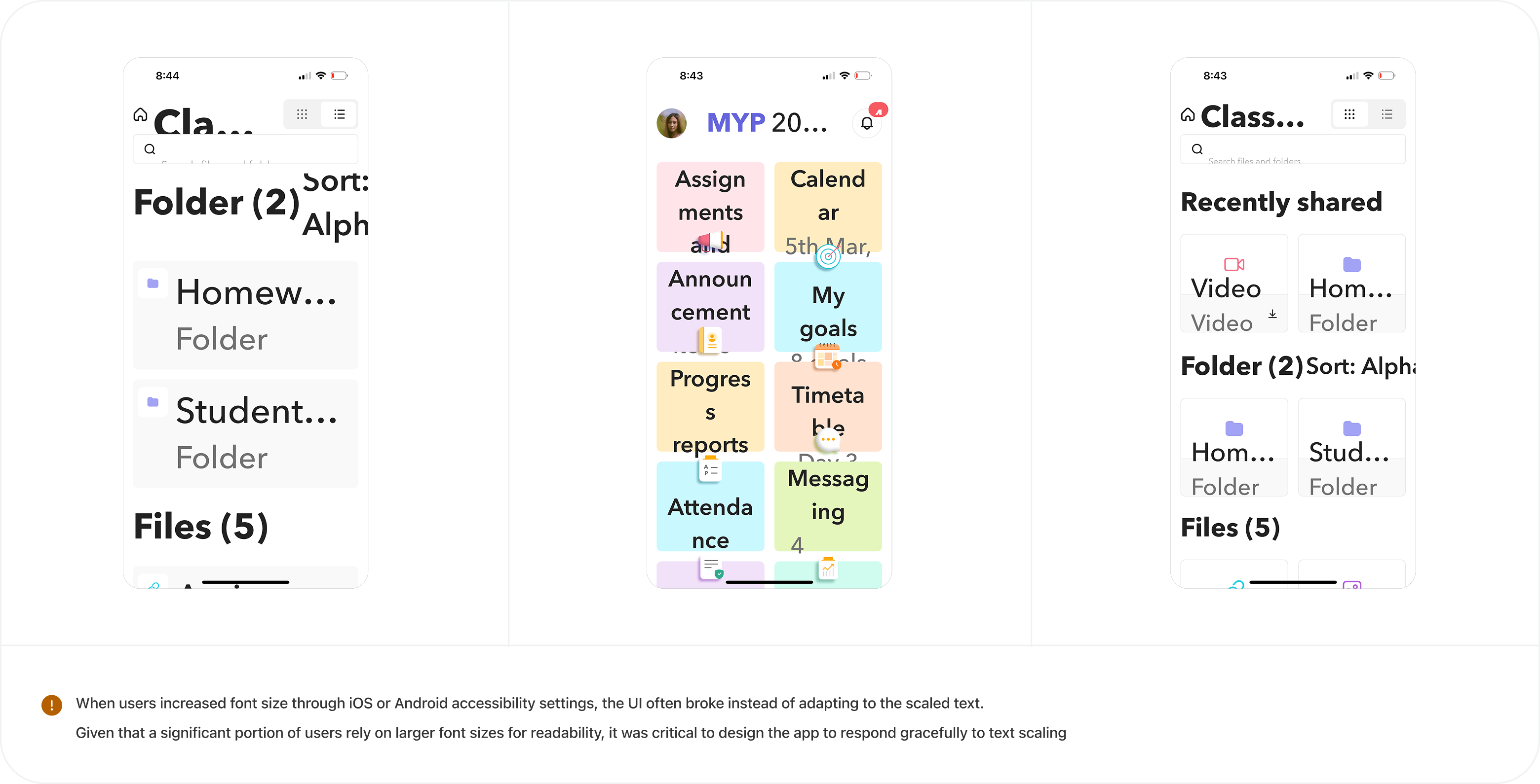
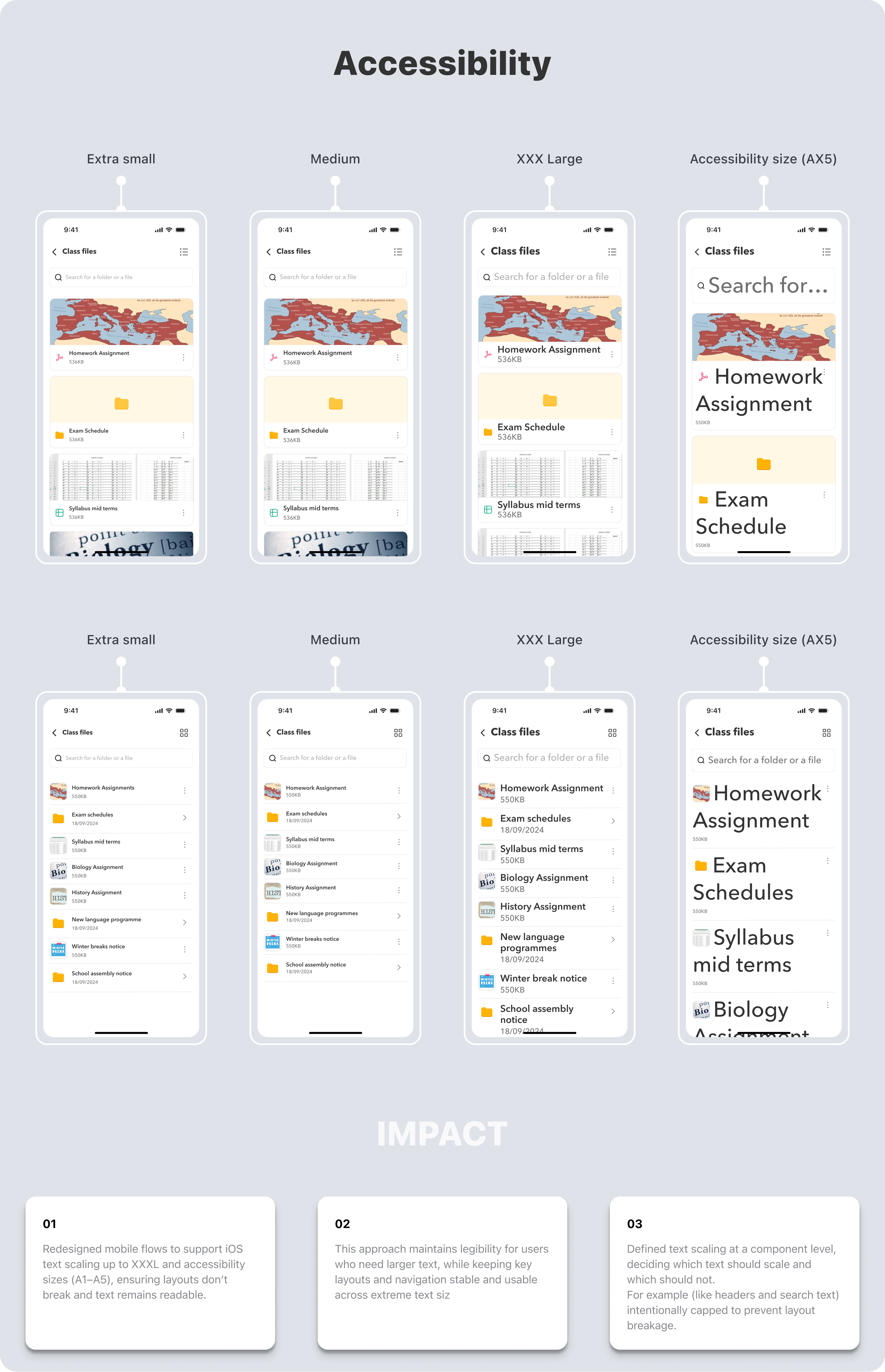
Font Scaling & Accessibility
"The app is really easy to use. Kudos to the team for keeping the app experience really slick."