Building a scalable design system that unified Toddle's multi-product ecosystem
When I joined Toddle, I inherited a design system that was fragmented, undocumented, and underutilized. With 100+ engineers and 10+ designers contributing across different pods, ensuring design consistency and accessibility was becoming increasingly difficult.
There were three core problems: inconsistency across modules, low reusability pushing teams to build custom solutions, and a lack of accessibility — designs didn't meet WCAG standards. The goal was clear: build a scalable, accessible, and collaborative design system that unifies Toddle's multi-product ecosystem while improving speed and consistency.
Building a Shared Visual Language
Before scaling the system, we needed to rebuild its foundations — color, typography, spacing, and grids — as the backbone for all future components. All colors were validated using WCAG 2.2 AA contrast ratios and tested for readability across Light, Dark, and High Contrast modes.
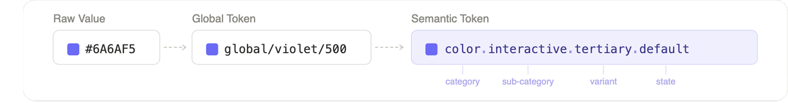
Color Tokens
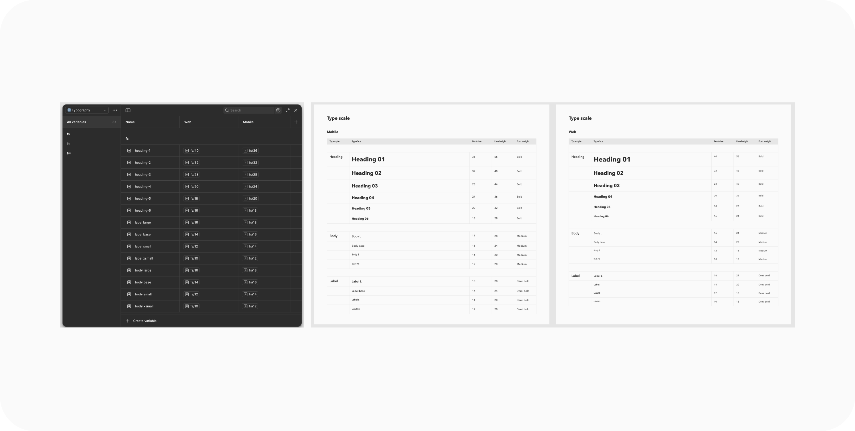
Typography
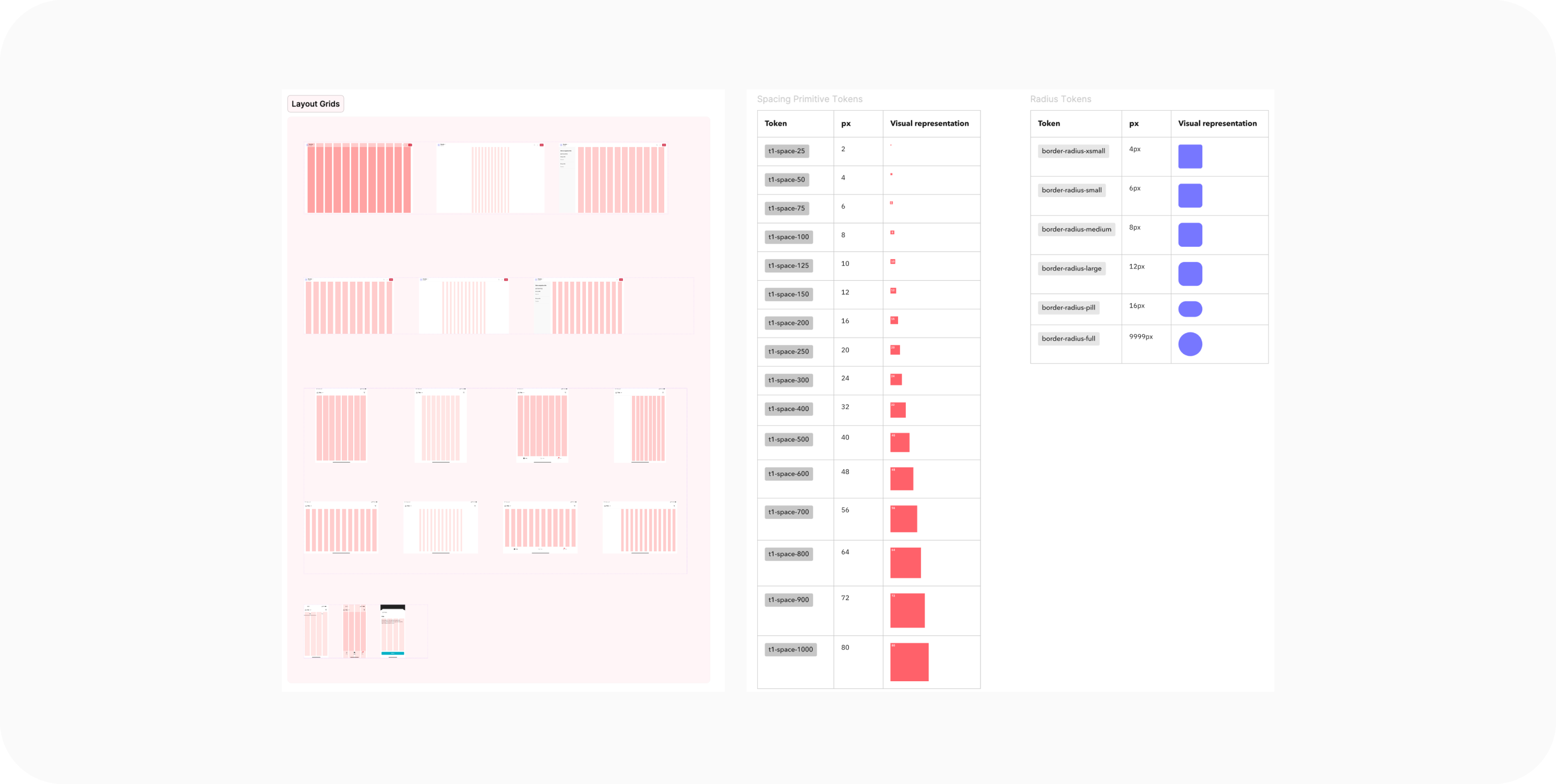
Spacing & Grids
Standardized spacing with a 4px-based scale aligned with a 12-column grid for web and a 4-column grid for mobile — reducing cognitive load and improving responsiveness.
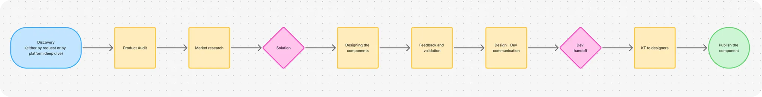
An Audit-Led Process
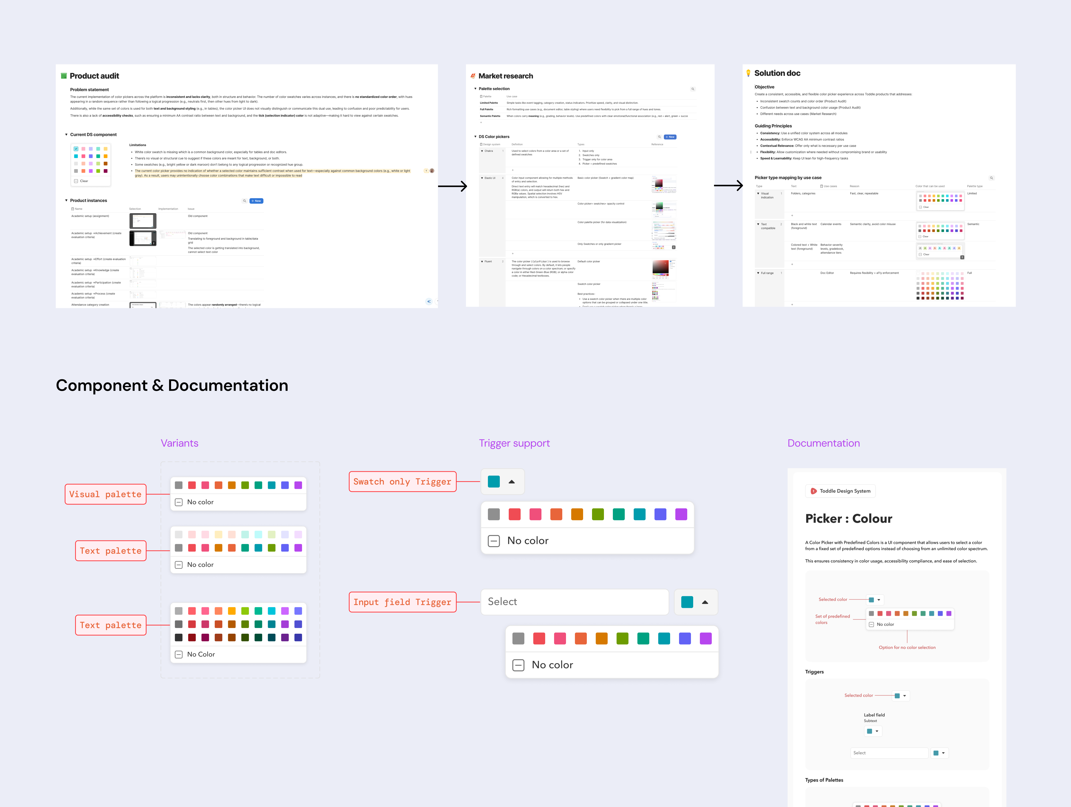
I owned the component creation process end-to-end, establishing audit-led guidelines and aligning multiple design teams on validated use cases and patterns before rollout. Before every component creation, revamp, or update, a comprehensive PRD is created to document product audit, market research, and the solution.
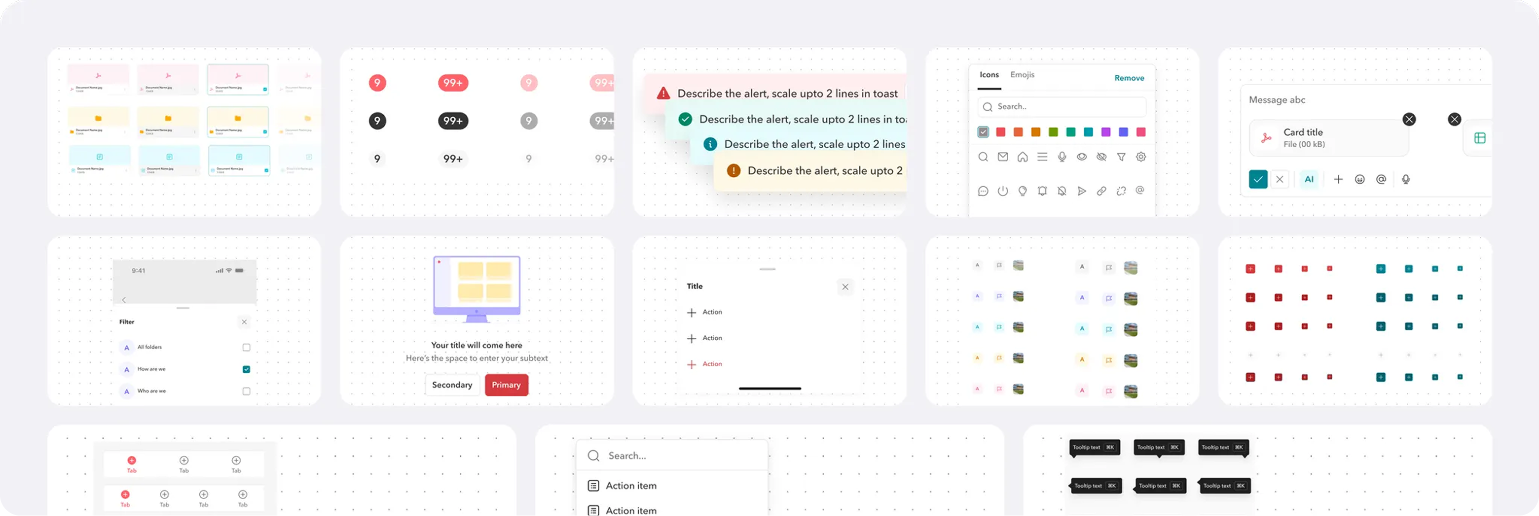
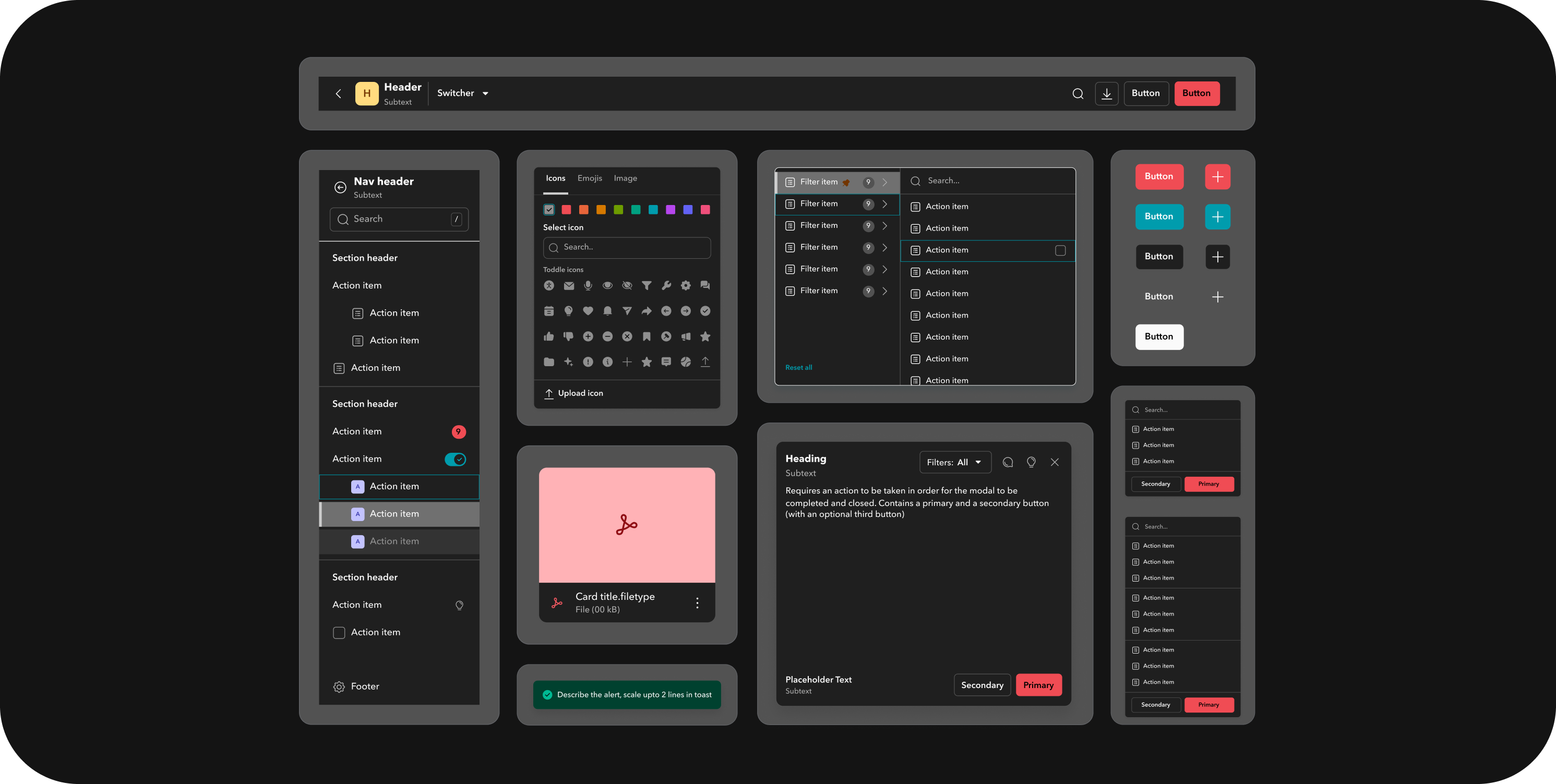
18+ Components Across Web and Mobile
Designed components from scratch covering core patterns like buttons, dropdowns, tabs, modals, inputs, and badges. Created component breakdown documentation to bridge design–dev handoff and collaborated closely with developers to ensure parity between Figma and React component libraries.
Adoption & Storybook
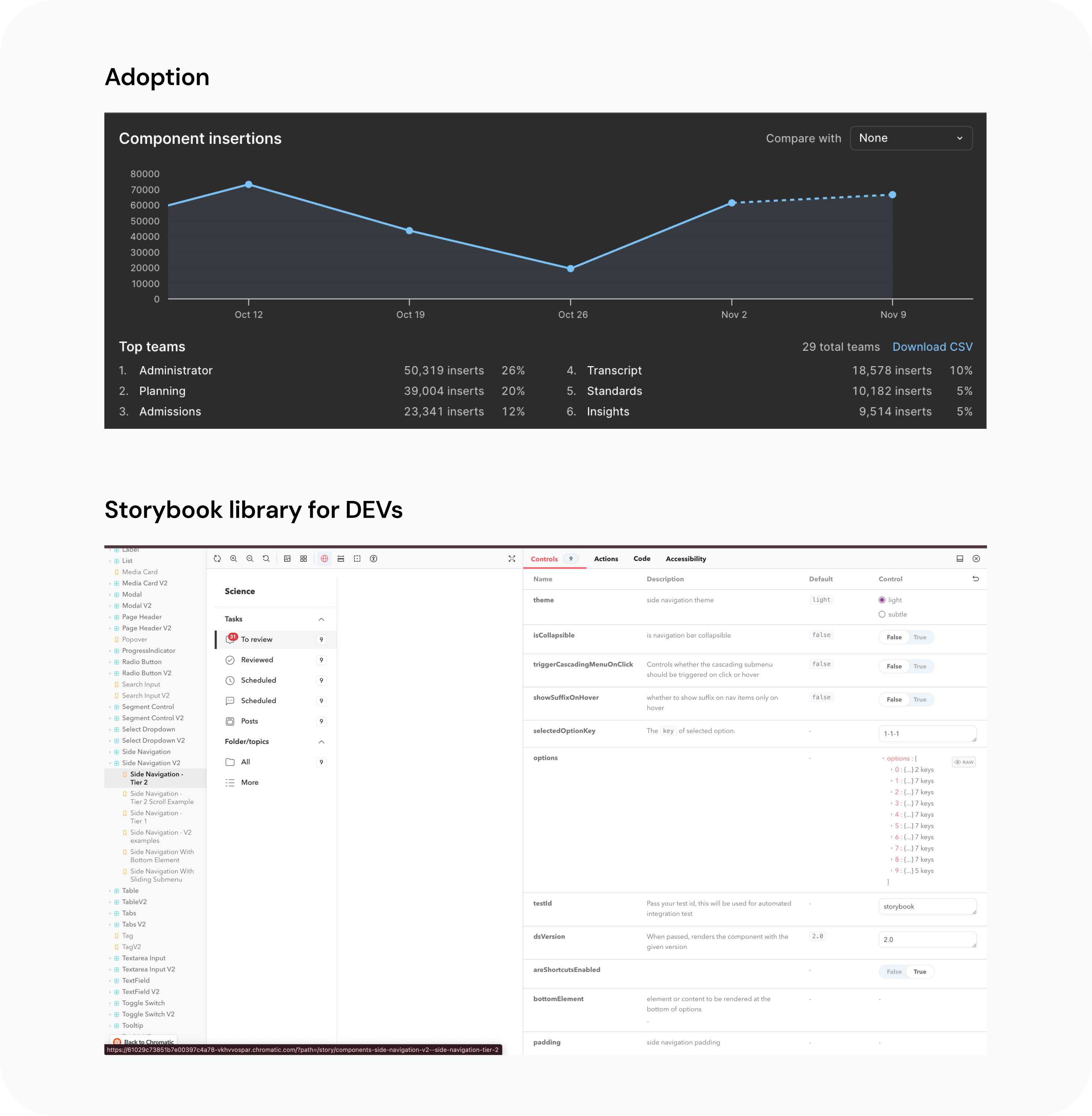
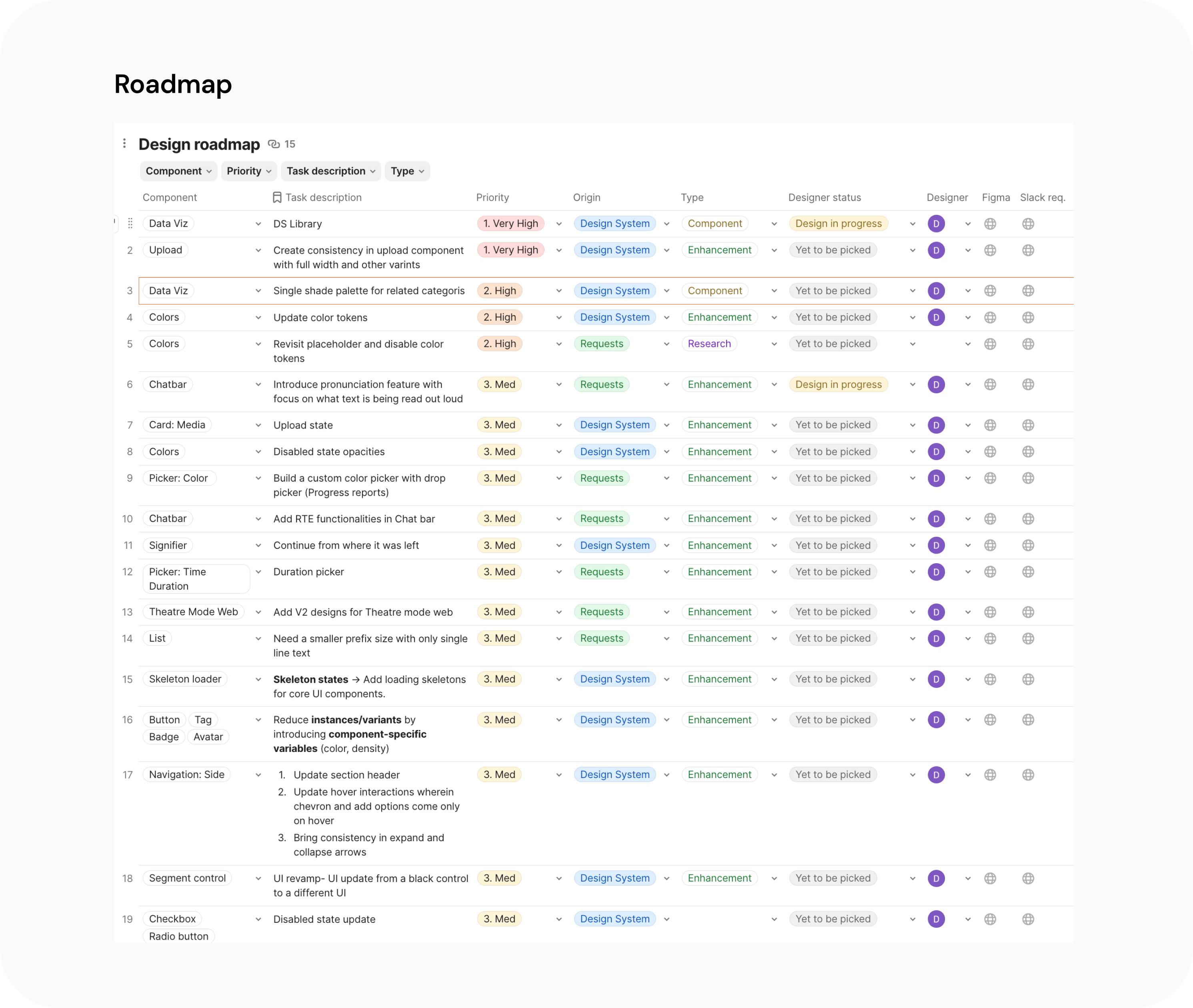
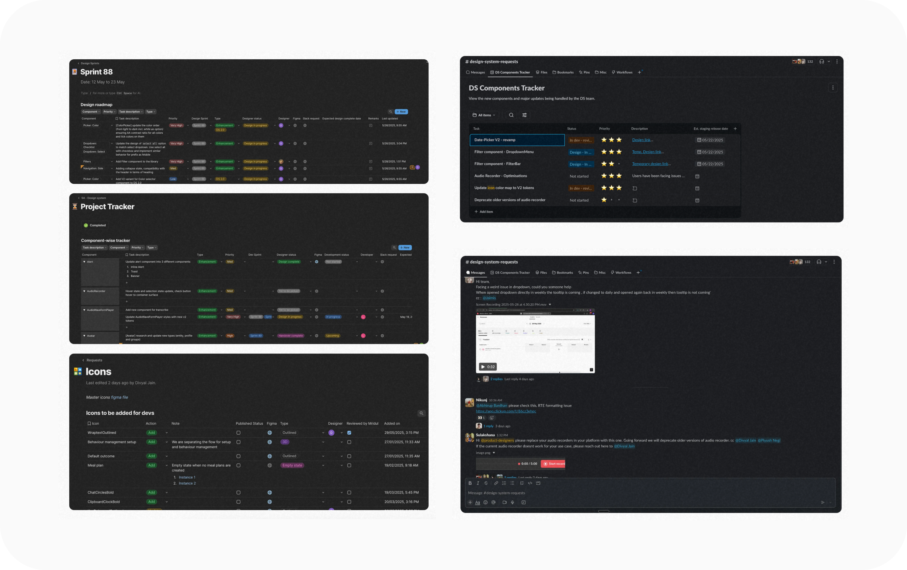
Tracking Requests and Enhancements
With scaling products came evolving requirements. To keep the system relevant, I established a Design System roadmap in Coda, enabling pods to log requests and track progress — ensuring component evolution without redundancy.
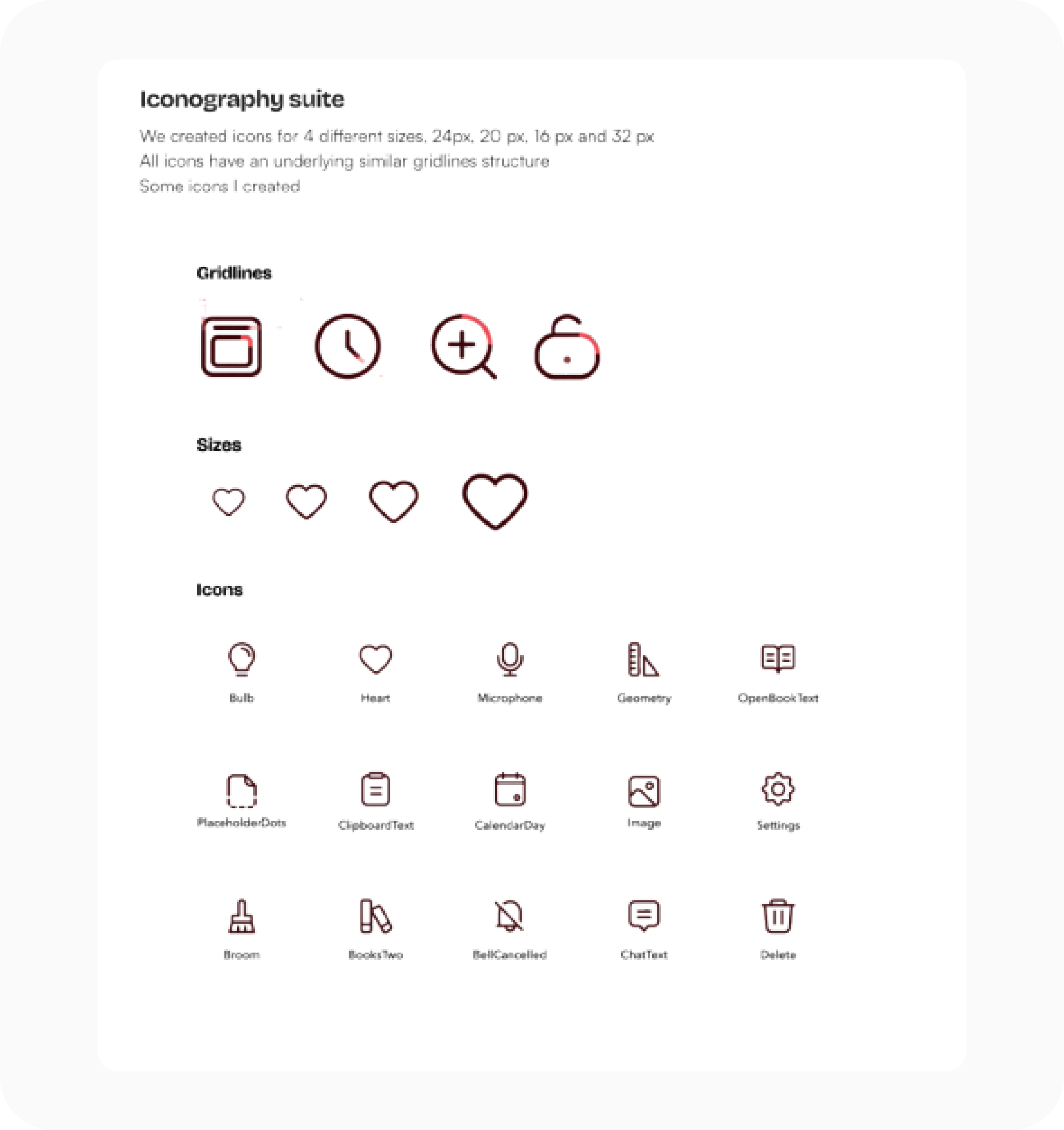
Expanding the Icon Library
Icons are essential in maintaining consistency and visual hierarchy across Toddle's multi-module ecosystem. I defined iconography guidelines covering grid sizes, corner radii, and stroke weights — and established a contribution process for designers via shared Figma libraries.
A Unified Chart System
As Toddle expanded its analytics features, multiple teams began designing their own charts — each using different colors, gridlines, and scales. I built a unified data visualization system covering foundational elements and six reusable chart types: Bar, Line, Donut, Box Plot, and Spider charts.
Chart Foundations
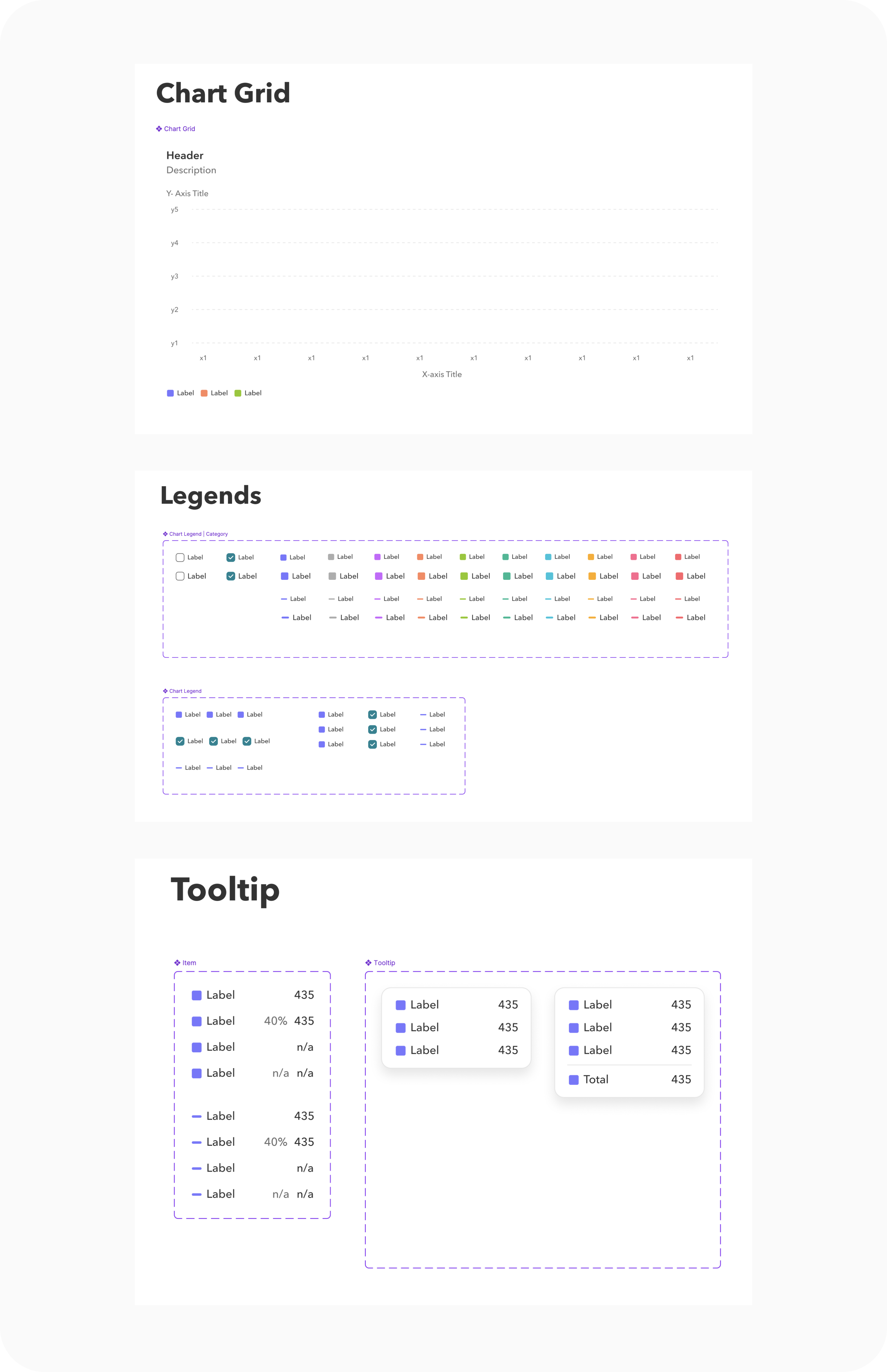
Chart Types
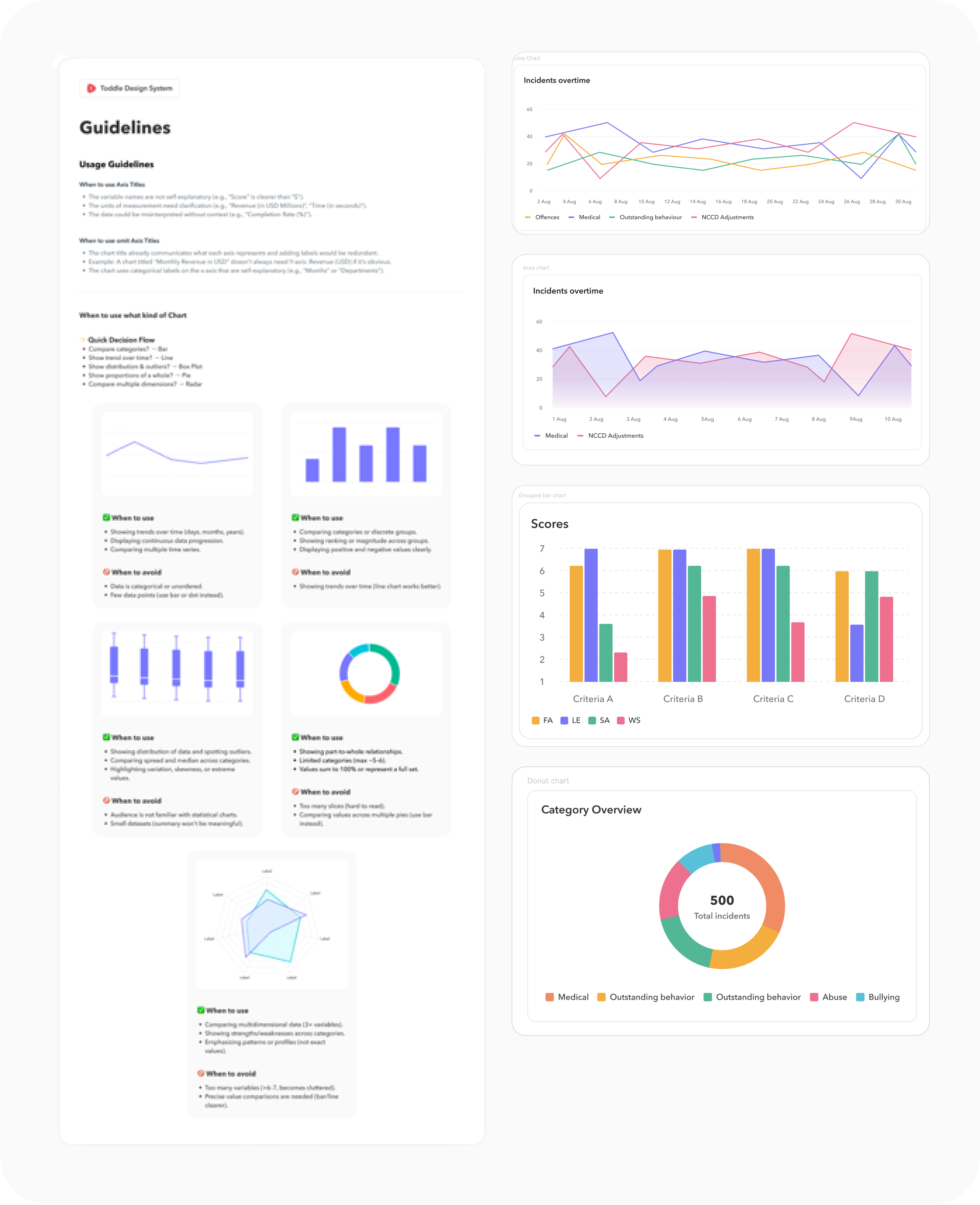
"This system turned scattered analytics visuals into a cohesive storytelling tool for teachers."
Making the System Self-Sustaining
A design system is only as strong as its documentation and governance. I developed a standard documentation framework — audit → research → scope → design → review → build → publish — and used Coda as a central repository. A dedicated Slack channel triaged requests and unblocked teams quickly.
"The Design System transformed how we collaborate — we now design and build in the same language."